Kerning
Kerning is an advanced feature of fonts that recognizes a pair of characters, then adjusts the spacing between them to some custom value. The default spacing between characters is zero - which is to say, the white space (side bearings) within each character are the only space shown.
Some letter combinations, like VA as an example, if the default side bearing spacing is used, the letters visually look very far apart. Kerning can help the visual flow of character pairs look more well considered. Many character pairs may need either negative or positive kern values to make them "look right".
The value of the kern can be thought of as an adjustment to the advance width of the left-hand character. That is to say, negative kern values will decrease the space between characters, and positive kern values will increase the space.
Class-based kerning
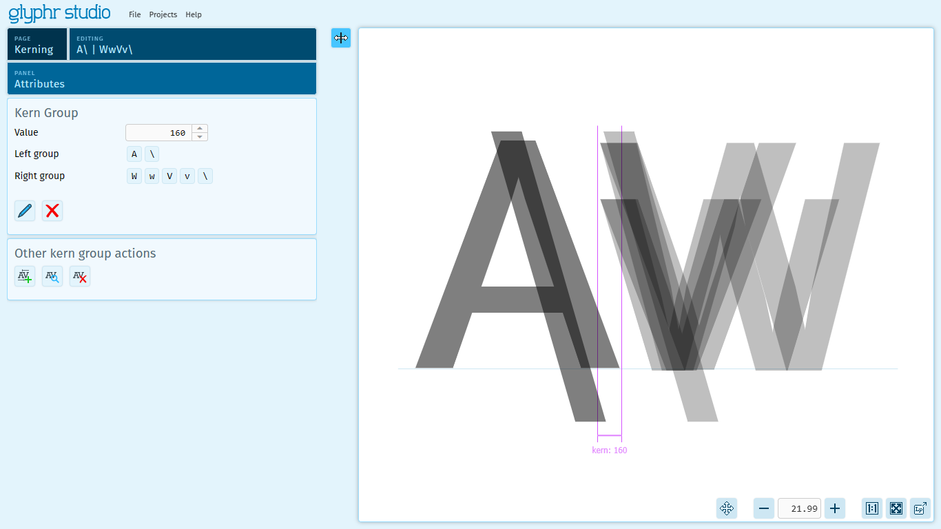
Font files encode kerning values as three pieces of information: a left character, a right character, and a horizontal adjustment value. Fonts with many characters can end up having a huge amount of kern pairs. Glyphr Studio uses a system called Class-based Kerning, where groups of characters with similar edges (like VvWw) can be treated as a single left-hand group, and a group of right-hand characters (for example,A/) can be treated as single group - which can be given a single value. When a font is exported, the permutations are saved as individual kern pairs. But, while editing, grouping common characters often simplifies the overall kerning process.
As an example, if a Kern Group's left group has 2 characters, and the right group has 10 characters, these will be permutated out into 20 individual kern pairs when exported.
Please note
- A maximum of 16,146 kern pairs can be exported to an OTF font. Kern pairs up to this maximum will be exported, and any beyond that will be skipped.
- Kern pairs must have valid source characters that exist in the project. If you have a kern pair that references one or two characters that are not in the project, the data for that kern pair will be skipped during OTF export.
- Importing Kern data from font files is supported for
GPOStable, Lookup Type 2 format. In this lookup type, only subtables with Pair Position Format 1 are supported. Subtables with Pair Position Format 2 are not supported.